Opening in Spring 2020 to queues of socially-distanced coffee aficionados lining the footpath, Argyle Place is one of those beautiful spaces where you just know the coffee and the food is going to be as good as its window impression suggests. (It’s amazing, by the way). With a steer from the owner and architects, Daysix had the enviable task of refining the brand elements and applying them across the cafe’s packaging, wayfinding, menus, social and merchandise.
Argyle Place has quickly established itself as a must-visit spot on the foodie scene. With a brand identity and application to match the quality of the food and service, it all comes together to offer one of the best cafe experiences in this fine foodie city.
If you’ve been there you’ll know what we mean. If you haven’t then what are you waiting for?
Scope
- Brand development
- Wayfinding/signage
- Print design

The Process
Working with the team at Argyle Place we spent time to understand the unique experience they were trying to create and the importance of the smaller details. From crockery and the subtlest of finishes to every ingredient, things were considered. Everything their for a reason and nothing there that wasn’t needed.
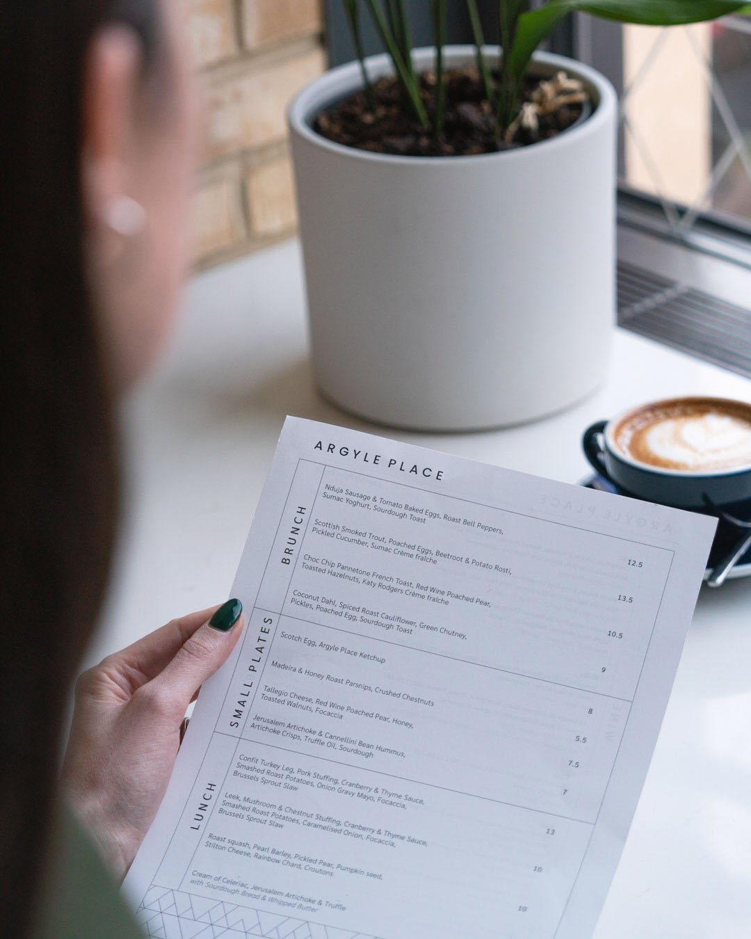
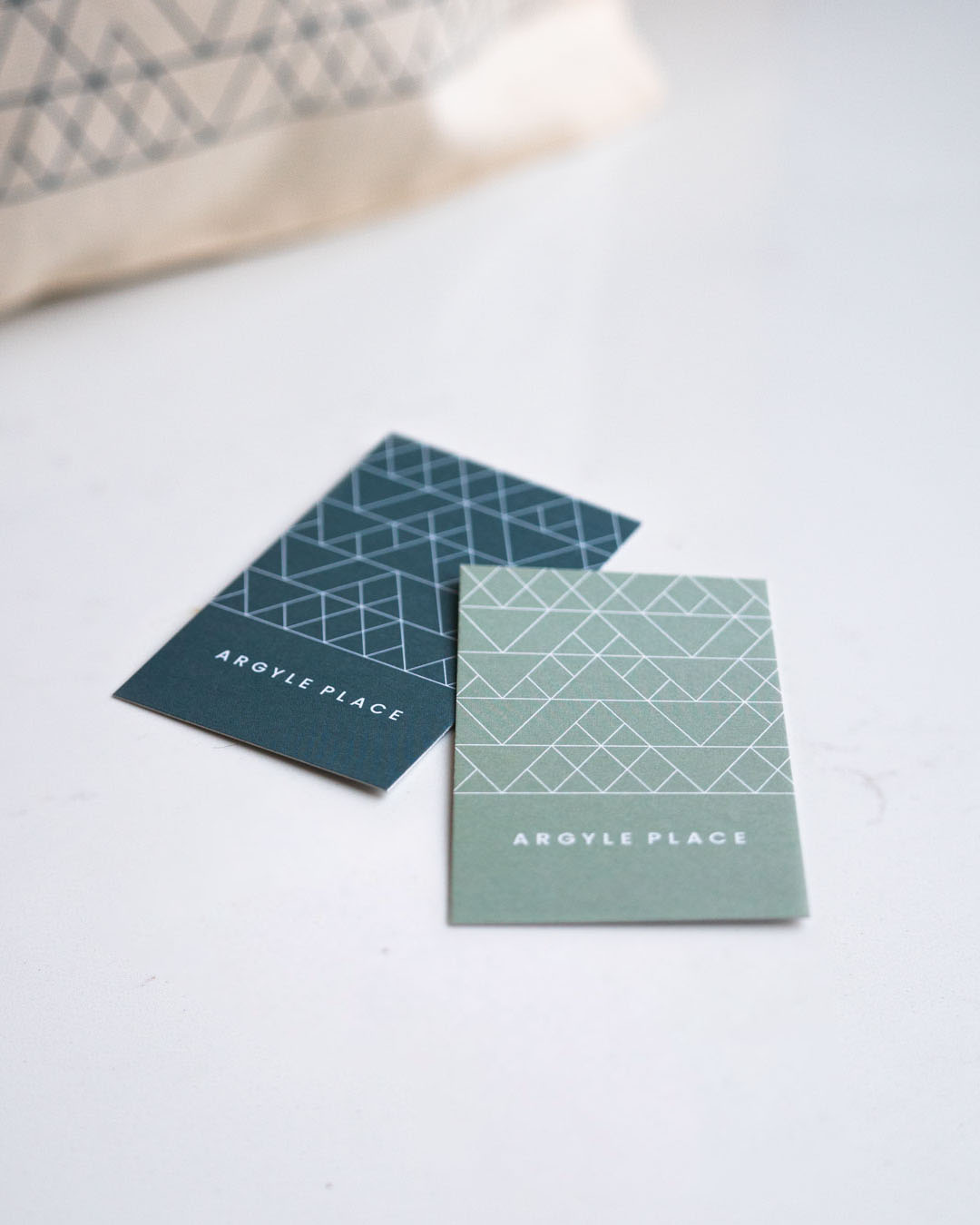
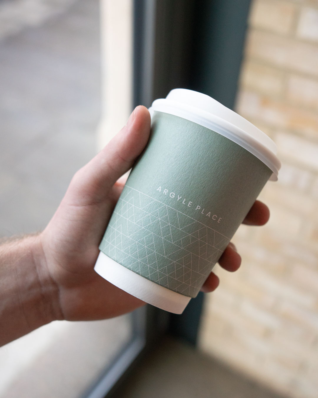
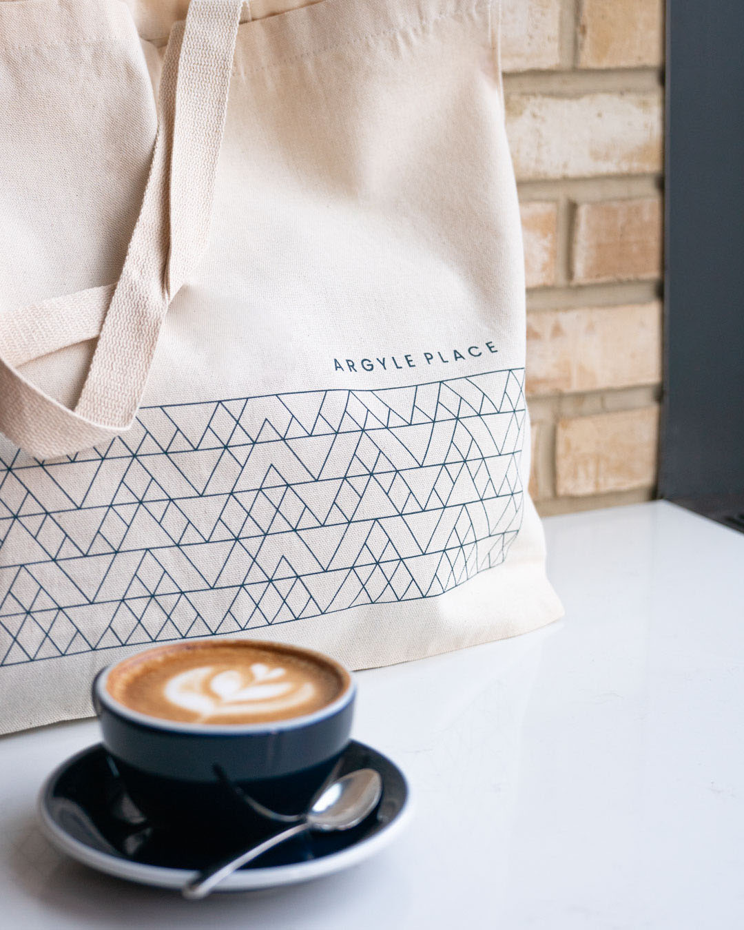
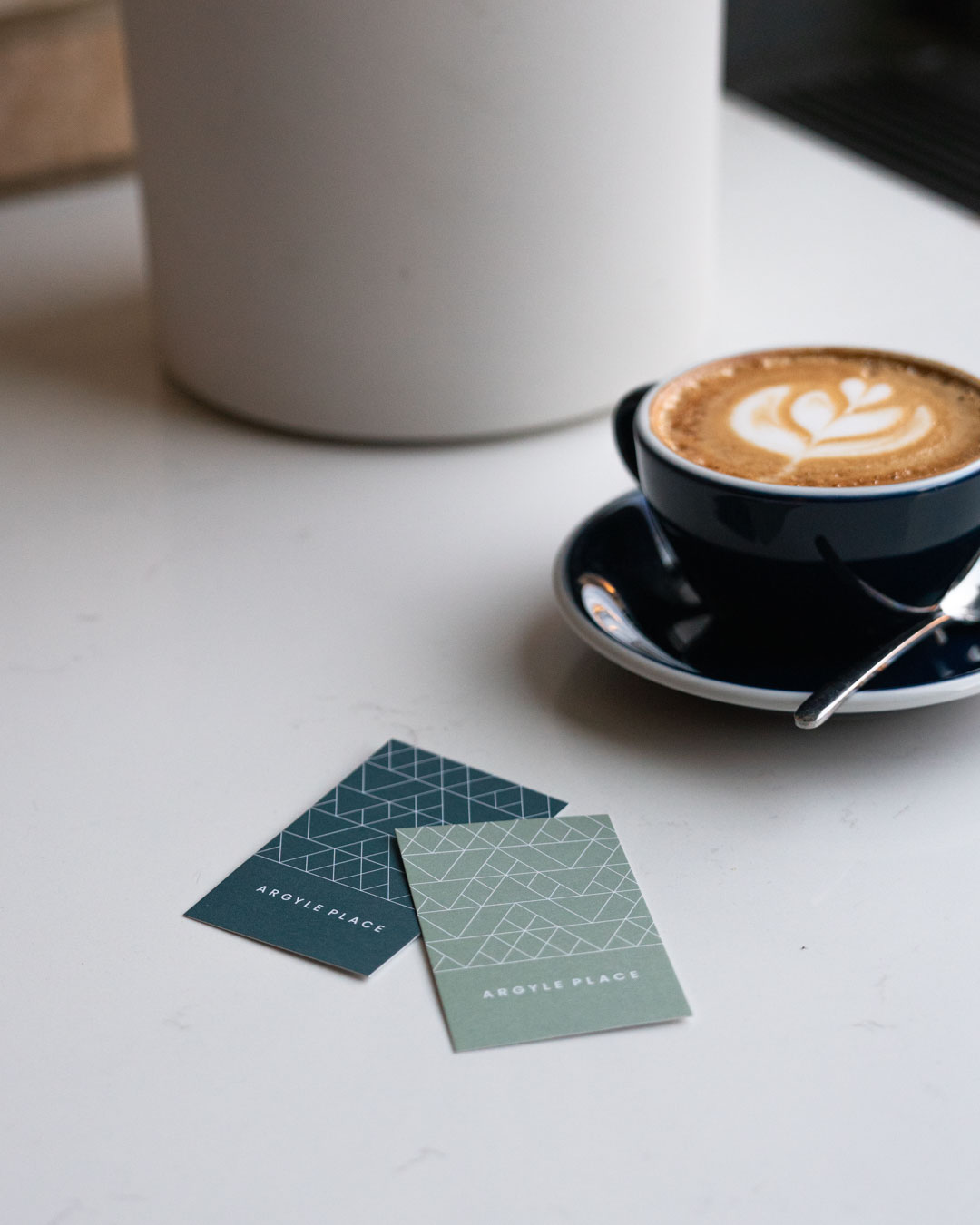
The minimal geometric letterforms of the wordmark express the ethos behind the brand – a timelessness and an emphasis on the tactile, atmospheric elements that create the space.
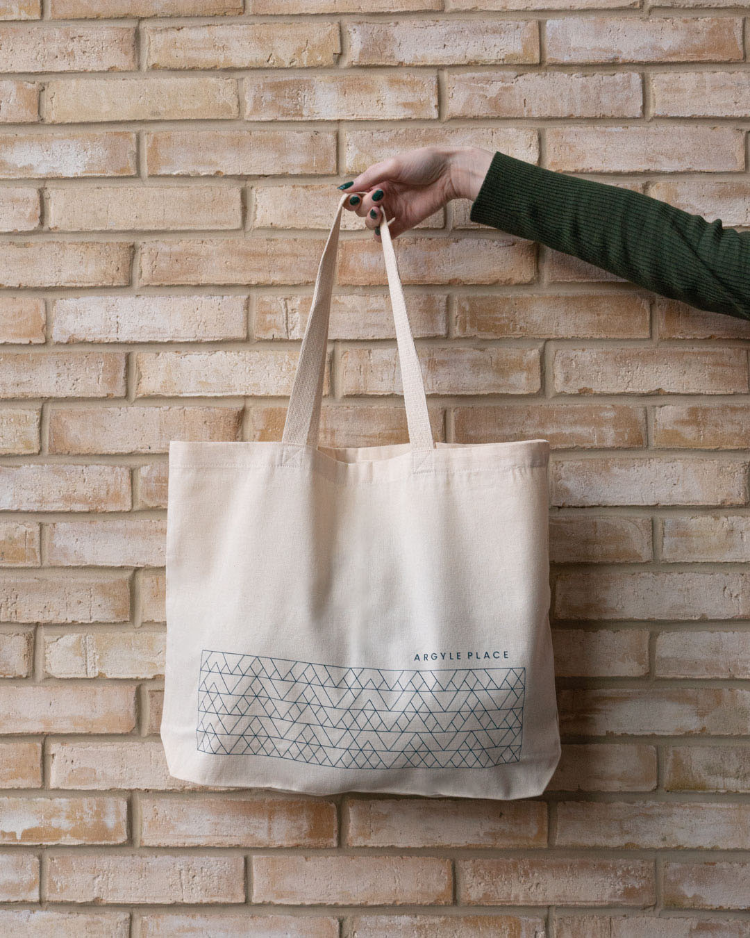
A custom abstracted argyle pattern lends an iconic and instantly recognisable cohesiveness to the brand, with a complementary colour palette of teal, sage and blush that reflects the contemporary and unique menu built around the idea of seasonality, crafted from locally sourced ingredients.
Process and expertise is important at Argyle Place, things are done right but not overtly so. Only nodded to throughout the application like in the design of the coffee menu that doubles up as a tutorial in the coffee/milk/water make up of each of the drinks.

The Outcome
Sophisticated but not pretentious, minimal but welcoming. We developed an identity that followed these principles and complimented the ethos. Extending the minimal pattern or signage where it added value and leaving the space to breathe when it didn’t.
The team at Argyle Place have done a fantastic job in creating a special space to eat and enjoy. In a crowded foodie city they are carving out their own identity and have become a beacon of quality in the South side of Edinburgh.